Step 1 of 4
Understand the overview
See balances and recent activity with clear labels and currency information.

Forma / Design concept
A mobile finance concept centered on understandable balances, simple navigation, and a considered payment flow.
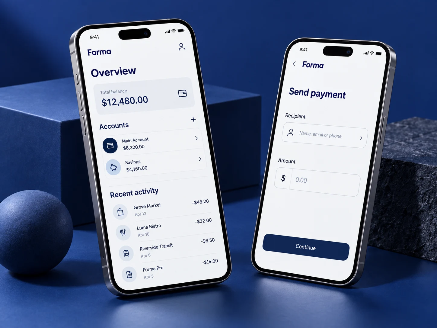
Everyday financial tasks can feel fragmented and difficult to follow. This concept explores how a focused mobile interface can make balances and actions easier to understand.
Clear hierarchy separates the overall balance from individual accounts. The payment screen reduces distractions and makes each input explicit. This is a visual exploration, not a functioning financial service.
Explore how clear information and careful confirmation steps can make a finance interface easier to understand.
Explore the process
Choose a step to see how the concept could work for its users.
Step 1 of 4
See balances and recent activity with clear labels and currency information.
Step 2 of 4
Filter and inspect a transaction without losing the wider account context.
Step 3 of 4
Choose a recipient and enter an amount, with explicit validation at each step.
Step 4 of 4
Show the recipient, currency, amount and any provider-confirmed fees before an action is authorised.
A proposed balance hierarchy separates available funds, accounts and recent activity. Figures in the visuals are illustrative.
Search, category filters and clear status labels would help people understand their own records.
Confirmation, authentication and recoverable error states would be central to a real payment flow.
Readable type, generous touch targets and clear feedback should support use on smaller screens.
A practical delivery direction to discuss and validate, rather than a claim that these features already exist.
Evaluate whether users understand a balance, locate a transaction and spot an incorrect payment detail. No financial service, provider partnership or measured outcome is claimed.
A good place to begin
Tell us what you are trying to achieve. We’ll help you shape a practical next step.